
Tables
Add simple markdown tables or richer, Notion-style tables with typed columns right inside a note.
inkwell supports two kinds of tables. Pick the one that fits.
| Markdown table | Table (customisable) | |
|---|---|---|
| Best for | Quick, portable grids | Lists you want to sort, tick and tag |
| Insert with | /mdtable |
/table |
| Column types | Text only | Text, Number, Select, Checkbox, Date, URL |
| Editing | Type in the cells | Click cells, menus on the headers |
| Works in other apps | Yes | Stored as a table code block |
Insert a markdown table
- On an empty line, type
/mdtableand press EnterEnter. - inkwell adds a three-column table. In Normal mode it renders as a styled table; in Markdown mode you see the pipes.
| Column 1 | Column 2 | Column 3 |
| -------- | -------- | -------- |
| Cell     | Cell     | Cell     |
Add a colon in the divider row to align a column: :-- left, :-: centre, --: right.
Insert a customisable table
- On an empty line, type
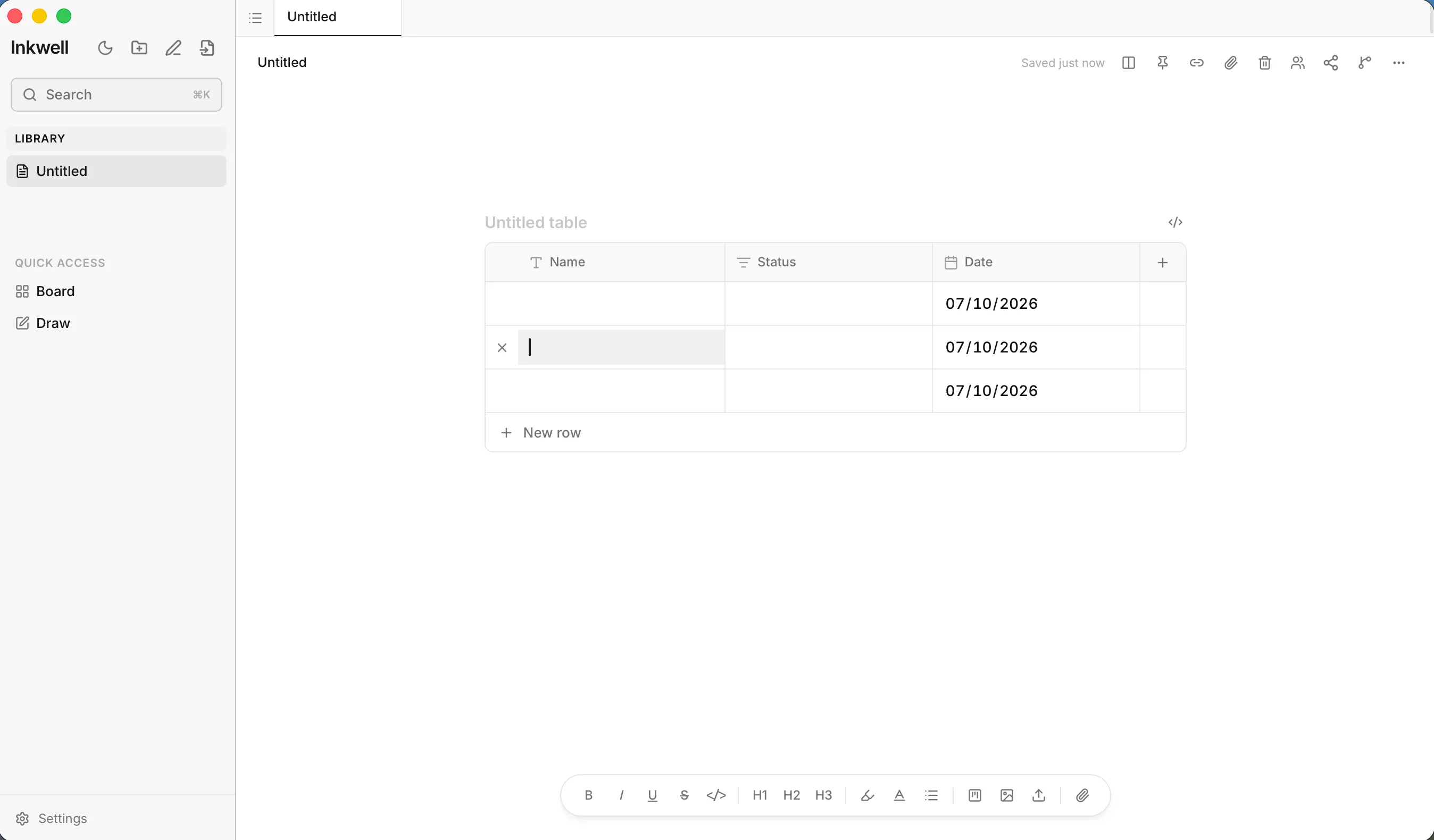
/tableand press EnterEnter. - A table appears with three columns (Name, Status and Date) and three rows. The Date cells start out set to today’s date.
- Click any cell to edit it.
Edit columns
Click a column header to open its menu:
- Rename the column in the text box at the top.
- Choose a Type: Text, Number, Select, Checkbox, Date or URL.
- Sort ascending or Sort descending.
- Move left or Move right.
- Delete column.
Drag the edge of a header to change a column’s width. Click + at the end of the header row to add a column.
Edit rows
- Click New row under the table to add a row.
- Hover a row and click × at its left edge to delete it.
Work with Select columns
In a Select cell you can search for an existing option or type a new one and create it on the spot. Each option has a colour (gray, red, orange, yellow, green, blue, purple or pink). Choose Clear to empty the cell, or Delete option to remove the option everywhere.
Totals
If any column is a Number column, a footer row shows the Sum of that column.
Give the table a title
Click Untitled table above it and type a name.
Edit the table as text
Hover the table and click the code icon (Edit as text) to see the underlying block. This is useful for pasting data in or fixing a spec by hand.
{
  "title": "Reading list",
  "columns": [
    { "id": "c1", "name": "Title", "type": "text" },
    { "id": "c2", "name": "Status", "type": "select",
      "options": [
        { "id": "o1", "label": "Reading", "color": "blue" },
        { "id": "o2", "label": "Finished", "color": "green" }
      ] },
    { "id": "c3", "name": "Pages", "type": "number" }
  ],
  "rows": [
    { "id": "r1", "cells": { "c1": "Dune", "c2": "o1", "c3": 612 } },
    { "id": "r2", "cells": { "c1": "Piranesi", "c2": "o2", "c3": 272 } }
  ]
}| Field | Meaning |
|---|---|
title |
Optional heading shown above the table. |
columns[].id |
A unique id for the column. Cells refer to it. |
columns[].name |
The header text. |
columns[].type |
One of text, number, select, checkbox, date, url. Unknown types fall back to text. |
columns[].width |
Optional width in pixels. |
columns[].options |
For select columns: a list of { id, label, color }. |
rows[].id |
A unique id for the row. |
rows[].cells |
An object mapping column ids to values. For Select cells the value is the option’s id. |